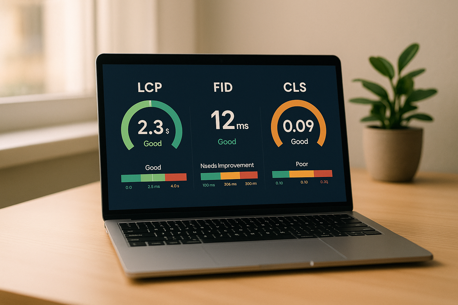
One SEO dashboard for everyone does not work. I’d split one shared SEO data source into 4 report views - one each for SEO, content, executives, and sales - because each team makes different decisions.
Here’s the short version:
- SEO teams need issue tracking, indexation, Core Web Vitals, rankings, and CTR shifts
- Content teams need topic performance, decay flags, content gaps, and page-to-conversion paths
- Executives need 5-8 KPIs tied to revenue, pipeline, share of voice, and paid search cost savings
- Sales teams need MQLs, SQLs, pipeline value, CPA, and sales cycle length
A few numbers show why this split matters:
- Only 54.6% of websites passed all Core Web Vitals thresholds in late 2025
- AI Overviews appeared on 44.4% of tracked Google queries
- 76% of AI Overview citations came from pages already in the organic top 10
That means the same traffic drop can mean very different things. For an SEO lead, it may point to crawl issues or AI Overview impact. For an executive, it means a hit to pipeline or revenue. For sales, it may show up as fewer demos or slower deal flow.
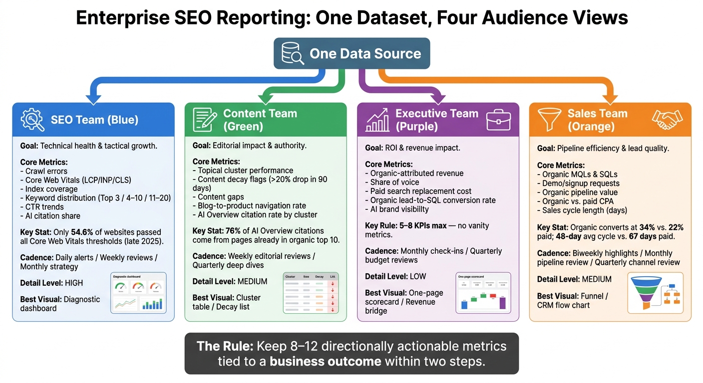
Enterprise SEO Reporting: 4 Team-Specific Dashboard Views
How to Create Data-Driven SEO Reporting for C-Level Executives | Conductor Demo Desk
sbb-itb-5be333f
Quick comparison
| Team | What I’d show | Main use | Cadence |
|---|---|---|---|
| SEO | Crawl errors, index coverage, CWV, keyword buckets, CTR | Fix site and ranking issues | Daily, weekly, monthly |
| Content | Cluster performance, decay, gaps, assisted conversions | Decide what to update, write, or remove | Weekly, quarterly |
| Executive | Revenue, pipeline, share of voice, paid replacement cost | Budget and channel decisions | Monthly, quarterly |
| Sales | MQLs, SQLs, demos, pipeline value, CPA, sales cycle | Lead quality and close-speed review | Biweekly, monthly, quarterly |
If I had to sum up the article in one line, it would be this: keep one data layer, then show each team only the metrics that lead to its next decision.
1. SEO Team Report
Primary goal
The SEO team report helps the team act fast. Its job is to surface technical problems, track keyword movement, and rank fixes before they affect revenue. It turns shared SEO data into day-to-day work.
This is the most operational of the four report views. For that reason, the dashboard should be broad and alert-driven.
Core metrics
SEO team reports should focus on leading indicators - the metrics that explain why traffic and conversions move.
That usually includes:
- Crawl health: 5xx errors, redirect chains, and robots.txt blocks
- Indexation rate: indexed pages vs. submitted pages
- Core Web Vitals: LCP, INP, and CLS
- Keyword distribution by position bucket: top 3, 4-10, and 11-20
Core Web Vitals deserve close attention. In late 2025, only 54.6% of websites globally passed all thresholds.
You should also include AI citation share and CTR trend. AI Overviews now trigger on 44.4% of tracked Google queries as of September 2025. So if Search Console shows impressions going up while CTR drops, that often points to AI Overview coverage, not a ranking problem.
Every metric in the report should lead to an action - a fix, a recrawl, an optimization task, or a watchlist item.
Preferred visuals
Use interactive dashboards in Looker Studio or Tableau so the team can drill down to the page and keyword level.
Detail and cadence
Run this report on three tracks:
- Daily automated alerts for critical failures, such as a 5xx spike or an indexation drop above 5%
- Weekly dashboard reviews for keyword shifts and crawl health
- Monthly reviews for strategy changes
Martial Notarangelo offers a useful filter for what belongs in the report:
"If a metric moves and your response is 'interesting,' it is noise. A metric passes the filter if it is directionally actionable."
That rule is simple and hard to argue with. If a metric does not lead to a clear next step, cut it.
The content team report uses the same data, but the focus shifts from technical health to topic performance.
2. Content Team Report
Primary goal
The content team report answers a simple question: what should we write, update, or remove?
It brings the big signals into one place - winning clusters, slipping pages, and content gaps. Then it turns those signals into editorial moves at the cluster, page, and topic level.
Core metrics
Use page-level and cluster-level metrics such as topical visibility, engaged sessions, content-assisted conversions, and blog-to-product page navigation rate. That last one matters because it shows whether informational content is moving readers closer to a purchase.
Content decay should have its own section in the report. Flag pages down more than 20% in organic sessions over 90 days and assets that have not been updated in 12+ months.
Track AI Overview citation rate by cluster to see which topics need stronger coverage. This matters because 76% of AI Overview citations come from pages already ranking in the organic top 10. In plain English, citation rate helps show which clusters need deeper content - not just better rankings.
Preferred visuals
A live Looker Studio dashboard works well for weekly editorial reviews. Cluster performance charts and decay flags give editors a fast read on what needs attention.
For quarterly planning, a ranked action list in a slide deck or spreadsheet usually works better than a dense dashboard. It keeps the report useful for weekly edits and quarterly planning without turning it into a mess of charts.
Detail and cadence
Use two cadences:
- Weekly editorial reviews to catch decay
- Quarterly deep dives for cluster audits and editorial planning
The quarterly review is also where gap analysis belongs - finding queries with real search volume but no dedicated landing page yet.
One practical filter can keep the report tight: apply the three-step "so what" test to every metric. If a metric does not lead to a decision by the third "so what?", cut it.
The executive report compresses these content signals into business impact.
3. Executive Team Report
Primary goal
The executive report answers one question: Is this making us money? Everything else comes after that.
This report takes the same SEO data and turns it into business language that leaders can act on. The content team report shows what changed. This one shows what those changes mean for revenue, pipeline, and market position. Unlike the content report, which looks at topic performance and engagement, the executive report is a budget and strategy tool. It helps CEOs, CFOs, and board members decide whether to put more money into organic search or move resources somewhere else.
"Lead with the business metric, not the SEO metric. Organic revenue, lead volume, or market share is the headline." - Rohit Kunal, Founder, IndexCraft
Core metrics
Keep it tight: 5-8 KPIs max. If a metric does not connect to revenue, pipeline, or market position, cut it.
| Include (Value Metrics) | Drop (Vanity Metrics) |
|---|---|
| Organic-attributed revenue or pipeline | Total keywords ranked |
| Share of voice | Authority scores |
| Paid search replacement cost | Raw total organic sessions |
| Organic lead-to-SQL conversion rate | Total backlink count |
It also helps to add AI visibility, so leaders can see whether the brand shows up in AI-generated results.
Preferred visuals
A one-page summary is the best format. For most executive teams, that is enough. A one-page revenue bridge works well: Reach → Engaged Visits → Leads → Revenue. Red/amber/green status markers are also easy for executives to scan.
Every major shift needs a note beside it. If organic traffic drops, say why. It could be an algorithm update. It could be seasonality. Either way, the point is to show leaders what changed and why it matters.
Detail and cadence
Use monthly check-ins to track performance. Save quarterly reviews for budget calls and bigger strategy choices. The quarterly report should end with one specific recommendation and a projected outcome.
"Executives do not fund the past. They fund a credible vision of the future." - Martial Notarangelo, Founder, Authority Specialist
The sales report keeps the same revenue lens, but adds lead quality, pipeline speed, and close-rate context.
4. Sales Team Report
Primary goal
The sales report answers a different question than the executive report: Which organic leads are closing, and how fast? It uses the same SEO data, but runs it through CRM and revenue attribution so sales can see which organic leads turn into deals - and how long that takes.
Sales teams don't need keyword counts. They need leads that are ready to buy.
Core metrics
Lead quality matters more than volume. Traffic doesn't mean much if it doesn't turn into qualified demand. The metrics here should follow the full path from first click to closed deal.
| Metric | Why Sales Cares |
|---|---|
| Organic MQLs and SQLs | Measures qualified prospects handed to sales |
| Demo and signup requests | Direct purchase-ready actions by organic visitors |
| Organic pipeline value | Dollar value of in-funnel leads attributed to SEO |
| Organic vs. paid CPA | Shows cost-efficiency of organic as a lead source |
| Sales cycle length (days) | Reveals whether organic leads close faster than paid leads |
Tie MQLs and demo requests back to the pages and topic clusters that drove them. That step matters. Otherwise, sales sees lead counts but not the source behind them.
One benchmark is worth keeping on the radar:
"Organic opportunities convert at 34% vs. 22% for paid search, with a 48-day average sales cycle vs. 67 days and 40% fewer sales touches." - Victor Valentine Romo, Business Operator and Consultant
Preferred visuals
Use a funnel view, not keyword tables. The Sales Funnel view works well here:
- Organic Reach
- Engagement
- Micro-Conversions
- Macro-Conversions
- Revenue Attribution
A simple table can do a lot of work too. Compare organic CPA to paid CPA, then add MQL-to-SQL conversion rates by channel. That gives sales leadership a fast read on where organic fits in the channel mix.
The next section compares these report formats by audience, metric mix, and level of detail.
Detail and cadence
A monthly pipeline review should cover lead flow and pipeline movement. A quarterly channel-to-revenue review ties SEO to sales targets and seasonality. In between, a short biweekly email with three to five highlights and lowlights helps sales and marketing stay in sync.
Annotate every major shift. If demo requests drop, say why if you know it. Maybe a content cluster lost traction. Maybe an algorithm update had an effect. That context keeps sales teams from guessing - and from landing on the wrong explanation.
Next, compare the four report formats side by side by audience, metric depth, and cadence.
Side-by-Side Comparison of Report Formats
The same SEO dataset shouldn't be shown the same way to every team. Each group looks at the data through a different lens, so the report should change too. Metrics, visuals, and reporting cadence all need to match the audience.
Tailor each report to the stakeholder's vocabulary and decisions. The same dataset should be split into an executive layer and an operator layer.
Here’s how the same SEO data can be packaged for each team:
| Team | Goal | Core Metrics | Preferred Visuals | Cadence | Detail Level |
|---|---|---|---|---|---|
| SEO Team | Technical health & tactical growth | Crawl errors, Core Web Vitals, index coverage, keyword distribution (1–3, 4–10) | Diagnostic trend charts, real-time dashboards, technical tables | Weekly / Daily | High |
| Content Team | Editorial impact & authority | Traffic by page type, topical cluster growth, content decay, sessions by intent stage | Performance tables, cluster audits, gap analysis spreadsheets | Monthly | Medium |
| Executive Team | ROI & revenue impact | Organic-attributed revenue, share of voice, CAC vs. paid, market share capture | One-page scorecard, revenue bridge charts, RAG status | Quarterly | Low |
| Sales Team | Pipeline efficiency & lead quality | MQLs/SQLs, organic-attributed pipeline, conversion rates, close rate by channel | Funnel flow diagrams, lead-to-opportunity charts, CRM-integrated tables | Monthly / Quarterly | Medium |
A good rule: keep core reports tight. Stick to 8-12 directionally actionable metrics that tie to a business outcome within two steps.
Pros and Cons by Report Type
No single report format works for every team. Each one has a clear upside - and a clear weak point. The table below shows where each report does its best work, where it tends to fall short, and who it serves best.
| Report Type | Main Advantages | Main Tradeoffs | Best Chart Type |
|---|---|---|---|
| SEO Team | Fast issue detection; deep technical monitoring | Jargon-heavy; overwhelming for non-specialists; lacks revenue context | Diagnostic dashboard |
| Content Team | Drives the editorial calendar; surfaces content decay and topical gaps | Ignores crawl health and financial attribution; can drift toward vanity traffic metrics | Cluster table / decay list |
| Executive | High-level ROI focus; justifies budget; scannable in under two minutes | Too shallow for optimization work; excludes the technical inputs that drive results | One-page scorecard / revenue bridge |
| Sales | Connects SEO to pipeline, MQLs/SQLs, and CRM data; tracks lead quality | Narrow focus; may undercount awareness and authority building | Funnel / CRM flow chart |
SEO, content, executive, and sales teams may look at the same data, but they don't use it the same way. That's the whole point. An SEO lead wants diagnostics. A content lead wants topic and decay signals. An executive wants ROI in plain English. Sales wants pipeline and lead quality.
Where enterprise reporting goes wrong is pretty simple: it mixes up activity with business impact. Across all four formats, the most common mistake is treating inputs - like rankings or content volume - as outcomes.
Executive reports are good for budget calls, but they don't go deep enough to diagnose SEO work.
The practical move is to keep one dataset and split the reporting into two views:
- a one-page executive view for decisions
- a detailed operator view for day-to-day work
That split keeps one SEO system useful for both decision-makers and operators.
Conclusion
The four report examples above point to the same takeaway: one dashboard for every audience falls short.
SEO teams need crawl diagnostics. Content teams need decay signals. Executives need revenue impact. Sales needs pipeline visibility.
The fix is simple. Use one shared data layer, then turn it into four audience-specific views:
- a one-page executive summary
- an editorial prioritization sheet
- a live technical dashboard
- a CRM-integrated sales report
That setup keeps reporting tied to each team's decisions, instead of forcing everyone into one universal dashboard.
Put organic revenue attribution first, not keyword rankings.
Cadence should match the decision cycle: daily or weekly for SEO, monthly or quarterly for content, monthly or quarterly for executives, and monthly for sales.
A good report should leave the reader with one clear next action. Teams may need different views, but they should all work from the same underlying data.
FAQs
How do I choose the right KPIs for each team?
Align KPIs with the decisions each team needs to make. Start with the report’s audience, then choose 5 to 9 KPIs that tie straight to their goals.
Different teams look at the same channel through different lenses. An executive usually wants to know if SEO is driving money and pipeline. Marketing wants to see traffic, engagement, and which topic clusters are doing the work. Sales cares about lead quality and the paths that turn interest into action. Technical teams need a clear view of site health and performance.
A simple breakdown looks like this:
- Executives: organic revenue, lead volume, cost-equivalent traffic
- Marketing: organic sessions, engagement, content performance by cluster
- Sales: lead quality, conversion paths
- Technical: crawl errors, page speed, Core Web Vitals
That way, the report stays focused. No fluff, no dashboard sprawl - just the numbers each team can use to make a call.
Can one SEO data source support all four report views?
Yes. One well-structured dataset can support all four report views.
The key is to keep one core data source and build role-specific dashboards or reporting layers on top of it. That way, executives get a clean one-page summary, while SEO and content teams can dig into the details they need - all from the same source of truth.
What tools work best for building these dashboards?
The best stack brings together three jobs: data collection, integration, and visualization.
At the core, most teams use Google Search Console and Google Analytics 4. Then they layer in Looker Studio to build automated dashboards for different audiences. That might mean one view for executives, another for the SEO team, and a simpler one for content leads.
For broader enterprise reporting, teams often add a warehouse like BigQuery, Snowflake, or Redshift, then connect that data to Tableau or Power BI for deeper reporting across channels and business units.
On the technical SEO side, Screaming Frog is a common choice. And platforms like Semrush, Ahrefs, BrightEdge, and HubSpot can help centralize reporting and cut down on manual work.