Most mobile navigation problems come down to 3 things: too many choices, too many taps, and missing links on mobile. If I want mobile navigation to work, I need to keep key pages within 3 taps, keep tap targets at 48×48 px, and make sure mobile includes the same core links as desktop for mobile-first indexing.
Here’s the short version:
- Mobile matters first - mobile drives about 62% of web traffic
- Users need simple paths - fewer top-level choices, clearer labels, and easy thumb reach
- Google needs crawlable links - links should be in the HTML, not hidden behind JS-only actions
- Pattern choice depends on the site - bottom tabs for 3-5 main destinations, hidden menus for larger sites, search-led nav for big inventories
- Hierarchy should stay shallow - important pages should be easy to reach without deep nesting
- Supporting nav still matters - breadcrumbs, hub pages, accordions, and footers help users and crawlers move around
- Testing should be done on phones - check mistaps, hesitation, menu use, drop-offs, and mobile crawl depth
In plain terms: I’d treat mobile navigation as both a UX system and an internal linking system. If people can’t find pages, conversions drop. If Google can’t find pages, rankings and indexation can slip.
This guide breaks down the main mobile navigation patterns, how to match them to user flows, what to watch for with SEO, and which metrics tell me when the menu needs work.
Advance UI/UX Design Tips – Design Mobile Bottom Navigation Like A Pro in 2025 & 2026
sbb-itb-5be333f
Choose the Right Mobile Navigation Pattern
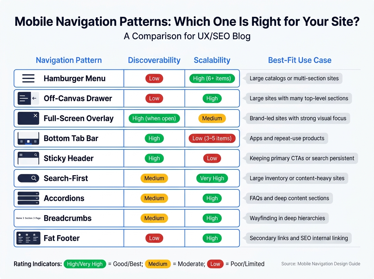
Mobile Navigation Patterns: Which One Is Right for Your Site?
Pick the navigation pattern based on how many sections you have, what users want to do, and how deep the content goes. Navigation issues often turn into conversion issues. If people can't find the next step, they drop off. The goal is simple: use the lightest pattern that still makes the main task and top-level sections easy to reach.
Use the table below to match the pattern to the size of the site and the job it needs to do.
| Navigation Pattern | Discoverability | Scalability | Best-Fit Use Case |
|---|---|---|---|
| Hamburger Menu | Low | High (6+ items) | Large catalogs or multi-section sites |
| Off-Canvas Drawer | Low | High | Large sites with many top-level sections |
| Full-Screen Overlay | High (when open) | Medium | Brand-led sites with a strong visual focus |
| Bottom Tab Bar | High | Low (3–5 items) | Apps and repeat-use products |
| Sticky Header | High | Low | Keeping primary CTAs or search persistent |
| Search-First | Medium | Very High | Large inventory or content-heavy sites |
| Accordions | Medium | High | FAQs and deep content sections |
| Breadcrumbs | Medium | High | Wayfinding in deep hierarchies |
| Fat Footer | Low | High | Secondary links and SEO internal linking |
Hamburger Menus, Off-Canvas Drawers, and Full-Screen Overlays
Hidden menus make sense when screen space is limited and you have too many top-level sections to show at once. They cut clutter and leave more room for deeper paths.
That said, don't bury key links in a way that search engines can't reach. Keep important links in the initial HTML so crawlers can follow them. Full-screen overlays need extra care too. They shouldn't block the main content on the initial load.
Bottom Tab Bars, Sticky Headers, and Search-First Navigation
If your site has three to five main destinations, visible navigation usually works better. Bottom tabs and sticky headers are a good fit when users need the same few actions on every screen.
Search-first navigation works best when people arrive with a clear goal and need to move fast through a large inventory. In that case, a prominent predictive search bar helps them jump straight to the right page instead of digging through deep category trees.
Accordions, Breadcrumbs, and Fat Footers for Deep Content
These patterns support primary navigation. They don't replace it.
Accordions are useful for FAQs, technical specs, and long pages where you need to organize a lot of information without dumping everything on the screen at once. Google indexes content inside accordions, tabs, and expandable sections when the text is present in the initial HTML response.
Breadcrumbs help users see where they are inside a deep hierarchy and give them a fast path back up. They also strengthen internal linking signals and can improve click-through rates in search results when paired with BreadcrumbList structured data.
Fat footers work like a safety net. They link to secondary and utility pages that don't belong in the main menu, which keeps those pages reachable for both users and crawlers.
Next, map the chosen pattern to your hierarchy and the paths users follow.
Structure Menus Around Information Architecture and Page Flows
Once you pick a menu pattern, tie it to what users are trying to do. Build navigation around user tasks, not your org chart. Before you name pages, list 8-12 core tasks users need to complete. On mobile, this matters even more. Screen space is tight, so shallow, task-based navigation helps people move fast.
Build a Shallow, Clear Mobile Hierarchy
Keep key pages within three taps of the homepage. If you feel tempted to add another menu layer, use a hub page instead. A hub groups related links in one place without making the menu deeper.
Top-level labels should be short and concrete. Pricing, Services, and Case Studies tell people what they'll get. Labels like Solutions or Resources do the opposite - they make users stop and guess.
Match Navigation to Common Mobile Flows by Business Model
Users don’t move through every site the same way. The path to value changes by business model, and the menu should match that path. When it does, each step feels easier.
| Business Model | Main Mobile Path | Recommended Menu Structure |
|---|---|---|
| E-commerce | Home → Category → Product → Cart | Nested categories plus breadcrumbs; sticky bottom cart/search bar |
| SaaS | Dashboard → Feature Area → Detail View | A "More" drawer for secondary tools |
| Publisher | Hub → Article → Related Article | Breadcrumbs + a "Learning" hub with topic clusters |
| Local Service | Home → Service Page → Contact/Booking | Sticky header with an action CTA; click-to-call in the footer |
For e-commerce sites, this gets messy fast. 38% of mobile sites have category structures that are either too deep, too shallow, or contain overlapping categories. If a product could fit in more than one category, pick one canonical path in the breadcrumbs. That keeps link equity from splitting across multiple routes.
These user flows also help determine which links earn a permanent spot in the menu.
Prioritize Primary Links and Move Secondary Actions Out of the Way
Not every link belongs in the main menu. Primary navigation should contain the five to seven destinations that drive the most traffic and conversions. Utility pages like About Us, Careers, Privacy Policy, and Support should live in the footer or a secondary drawer. That keeps the main menu tight and easier to scan.
If you need to hide secondary links with CSS, that’s fine - but load them in the initial HTML. Don’t make users tap before those links exist.
Some links sit in the middle. Account, Support, and Location pages may not belong in primary nav, but they still need easy access. A sticky bottom bar works well for frequent actions like Cart, Search, or Account. A focused top-level menu and a clean footer make user paths simpler - and crawl paths simpler too.
That same hierarchy should also support crawl paths and internal links.
Design Mobile Navigation for Technical SEO and Internal Linking
A menu pattern only does its job if mobile gives crawlers the same paths that desktop does. On mobile, navigation shapes crawl depth, indexation, and internal link flow because Google uses the mobile version as the main version for indexing. So the rule is simple: mobile should expose the same core links as desktop.
Keep Important Pages Reachable Under Mobile-First Indexing
Google crawls and indexes from the mobile version. If your mobile menu hides or drops links that appear on desktop, key pages get harder to reach for both people and crawlers. Keep the full link set available in mobile HTML. If needed, use CSS to hide or reposition items on the screen - but keep the links in the rendered HTML.
Once those links are in place, use page hierarchy and anchor text to make the path clearer.
Use Breadcrumbs, Hub Pages, and Contextual Links to Strengthen Crawl Paths
These link types pull double duty. They help users find their way, and they help crawlers move deeper into the site.
| Link Type | SEO Impact | Crawl Coverage | User Engagement |
|---|---|---|---|
| Header Links | High; defines primary site hierarchy and distributes core equity | High; found on every page; primary crawl path for bots | High; main way users orient themselves |
| Breadcrumbs | High; reinforces hierarchy and topical clusters | High; provides a clear vertical path back to hubs | Moderate; helps users orient themselves |
| In-Content Links | High; provides contextual relevance via descriptive anchor text | Good; helps bots find related deep content | High; natural path to related pages |
| Footer Links | Medium; useful for secondary and utility pages | Medium; site-wide discovery of deep pages | Low; mainly used for utility tasks |
Breadcrumbs are especially helpful for cutting crawl depth and reducing the chance of orphan pages. Pair visible breadcrumbs with BreadcrumbList JSON-LD schema so Google can read your site structure even if the visual trail is trimmed down on mobile.
In-content links matter too. When you place them naturally in body copy, they add topical context and connect cluster pages back to hub pages in a way that makes sense to both readers and bots.
The next issue is rendering. A link can exist on paper and still fail in practice if it never shows up in crawlable HTML.
Avoid Technical Problems Caused by Navigation Components
Hidden menus still break down if the links never make it into the mobile DOM. JavaScript-heavy menus can also slow crawling and user interaction. Render critical navigation links in HTML. If you use accordions or collapsible menus, that's fine - as long as the links inside them appear in the server-rendered HTML. For navigation, use standard <a href> tags instead of JavaScript click handlers.
Keep critical menus in server-rendered HTML and make sure they open right away. Also watch page weight. HTML larger than 2 MB can be truncated during crawling, which means links near the bottom may not be seen.
Test, Measure, and Improve Mobile Navigation
Run Usability Tests on Real Devices
Desktop-only testing misses the stuff that trips people up on phones. Test on actual mid-range Android devices - for example, a Moto G Power on a real 4G connection - instead of relying only on desktop or premium phones. High-end phones can mask the friction most users deal with every day. After your navigation goes live, check it on real devices before you make any call on how well it works.
Start with thumb reach. Then test the tasks people care about: finding categories, locating products, moving through services, and finishing checkout or contact flows. Pay close attention to hesitation, mistaps on small targets, and moments when users open the menu more than once on the same page. That often means the labels don't line up with what users expect.
Use tree testing and first-click testing together to check the menu pattern, hierarchy, and internal links you set up earlier. Tree testing removes the visual layer and gives users a text-only menu. That makes it easier to see whether your labels and structure make sense. First-click testing tells you whether the first tap puts users on the right path. If that first tap is wrong, the rest of the journey usually breaks down. Pair both methods with session recordings so you can spot mistaps and dead ends. These tests also give you the baseline numbers to track after launch.
Track User Paths, Menu Engagement, and SEO Signals
Once the navigation is live, you don't need a huge dashboard. A small set of metrics will tell you most of what matters. In GA4, look for the menu items that get most of the clicks. That click split shows which links should sit higher and which ones can move down.
The table below ties each metric to the action it should trigger:
| Metric | Optimization Action |
|---|---|
| Menu Open Rate (low) | Increase the size or contrast of the hamburger icon; make it sticky |
| Path Drop-off | Identify the step where users exit and simplify the sub-navigation |
| Search Bar Usage Spike | Move frequently searched terms directly into the primary menu |
| Crawl Depth > 3 | Add breadcrumbs and hub pages to bring deep pages closer to the root |
| Internal Link Count (mobile vs. desktop gap) | Audit mobile/desktop parity to protect link equity |
| INP > 200ms | Defer noncritical JavaScript and cut third-party menu scripts |
| Tap Target Errors in Search Console | Increase button and link size |
For SEO, segment Google Search Console data by device type. If mobile clicks or average position start slipping compared with desktop, that's often a sign of a navigation or usability issue. Then check that against crawl data from Screaming Frog to find orphan pages with zero internal links pointing to them. If a page has no internal links, it's close to invisible for both users and Googlebot.
Conclusion: Core Rules for Mobile Navigation Design
The same signals you spot during testing should shape the next update. Good mobile navigation usually comes down to a few choices done well. Pick the pattern that fits the site: a bottom tab bar for a small set of core destinations, a hamburger drawer for broader content, or search-first navigation when search is the main route. Keep the hierarchy shallow so any important page is reachable in three taps or less. And make sure mobile shows the same internal links as desktop, because with mobile-first indexing, links missing on mobile are invisible to Googlebot from a link equity standpoint.
Structure alone isn't enough. You also need to support the paths that matter most to the business - product discovery, service discovery, contact, and checkout - and check every change with real-device testing and crawl data before you treat it as finished. Strong mobile navigation helps users stay oriented and gives crawlers a clear route through the site.
FAQs
How do I choose the best mobile navigation pattern?
Keep your site structure shallow so people can reach key pages within three clicks. Build the main sitemap around user intent, not your internal org chart.
For mobile, keep navigation simple and easy to use:
- Use a hamburger menu for primary categories
- Limit top-level items to five or six
- Add sticky navigation for key CTAs
- Use breadcrumbs
Touch behavior matters too. Make tap targets at least 48 x 48 px with 8 px of spacing between them. Then test the setup with tree tests and first-click tests.
What makes a mobile menu SEO-friendly?
An SEO-friendly mobile menu helps search engines move through your site and find the same pages and content that users can access. That means your navigation links should be in the initial HTML, use standard HTML anchor tags, and keep key pages within three clicks of the homepage.
Keep the structure shallow. In most cases, five to seven top-level categories is a good range. It gives users enough direction without turning the menu into a mess.
A few details matter here:
- Use breadcrumbs and add BreadcrumbList schema
- Keep the menu from taking over the screen
- Show critical, keyword-rich text by default instead of hiding it behind extra taps or scripts
Think of the mobile menu as a map. If the map is too deep, too crowded, or partly hidden, both users and crawlers have a harder time getting where they need to go.
Which metrics show mobile navigation problems?
Watch for high bounce rates, uneven click distribution, and high exit rates on category pages. Those are common signs that people aren’t finding their way with ease. Another red flag: more site searches for terms that are already in the menu. If users are searching for something your navigation already lists, the menu likely isn’t doing its job.
It also helps to review user flow, path drop-offs, task completion, session recordings, and heatmaps. These can show where people get stuck - whether that’s a confusing path, a key page people keep missing, or mobile issues like awkward tap targets and poor thumb reach.