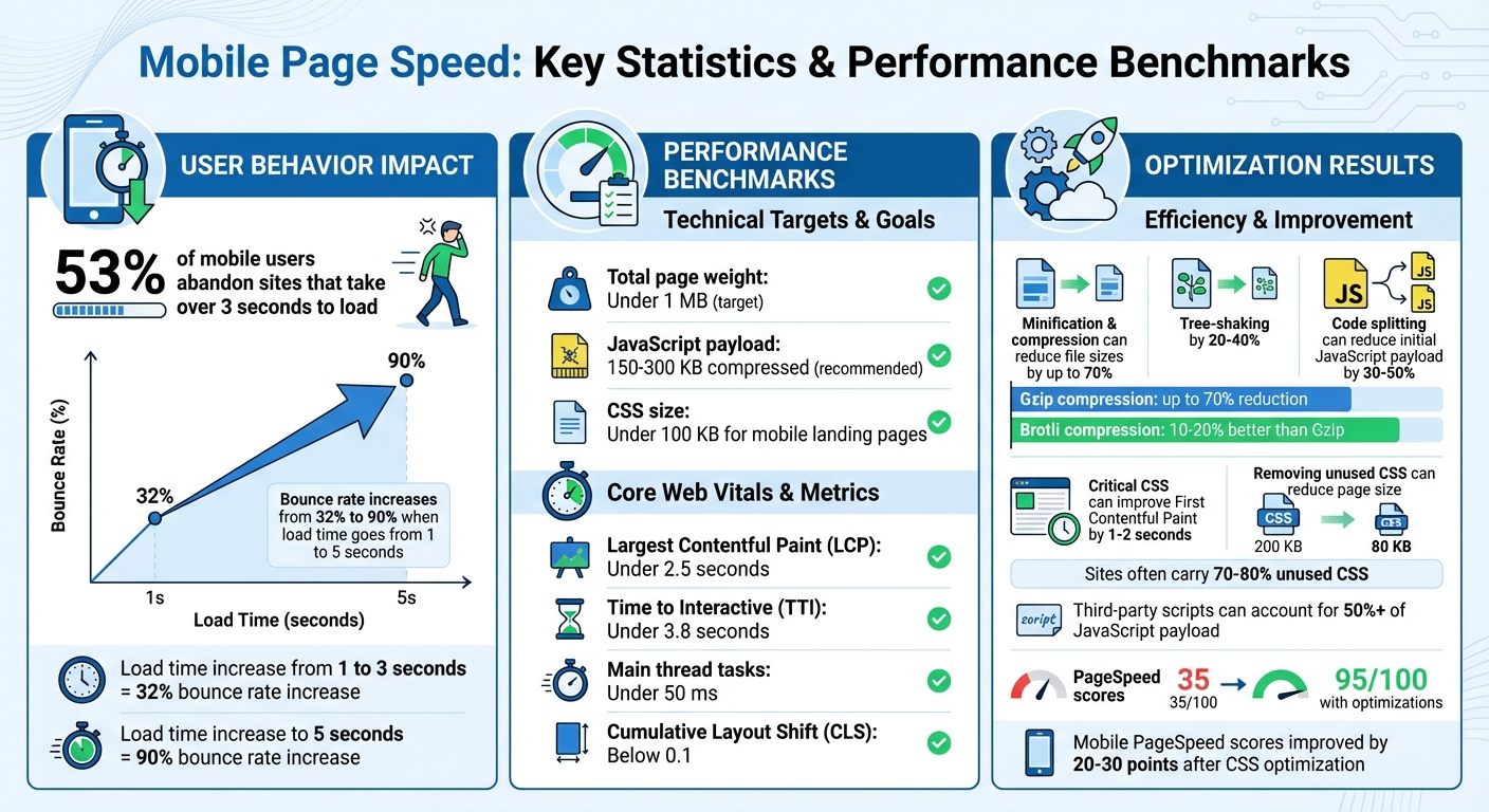
53% of mobile users leave a site if it takes over 3 seconds to load. Slow mobile page speed can hurt user experience, search rankings, and conversions. JavaScript and CSS are often the main reasons for poor performance, but optimizing them can improve loading times, boost rankings, and increase conversions. Here's what you need to know:
- Why Speed Matters: A delay from 1 to 5 seconds can increase bounce rates from 32% to 90%. Google prioritizes fast mobile sites with an LCP (Largest Contentful Paint) under 2.5 seconds.
- Common Issues: Render-blocking scripts, unused CSS, oversized files, and third-party scripts are frequent culprits.
- Key Fixes:
- Minify and compress JavaScript and CSS to reduce file sizes by up to 70%.
- Use
deferorasyncattributes for scripts to prevent blocking. - Remove unused CSS and extract critical CSS for faster rendering.
Start by auditing your site with tools like Google PageSpeed Insights or Lighthouse. Set performance goals: keep total page weight under 1 MB, LCP under 2.5 seconds, and JavaScript payloads below 150 KB. Regular monitoring ensures your site stays fast and user-friendly.
Mobile Page Speed Statistics and Performance Benchmarks
Mobile Page Speed Optimization: Deep Dive for Better Scores
Auditing JavaScript and CSS for Mobile
Reviewing your code is essential to uncover performance issues. Using the right tools, you can identify bloated files, render-blocking resources, and unused assets. This process sets the stage for the improvements we'll cover in the next sections.
Tools for Performance Auditing
One of the best places to start is Google PageSpeed Insights. It evaluates your mobile page under simulated throttling and gives you a performance score out of 100. The tool flags issues like render-blocking JavaScript, unused CSS, and oversized bundles. By addressing these problems, some sites have boosted their mobile scores from 35/100 to 95/100.
Another powerful tool is Lighthouse, which is built into Chrome DevTools. Running it in Incognito mode with mobile throttling enabled provides a realistic view of how your site performs under typical U.S. mobile conditions. It evaluates Core Web Vitals metrics such as Largest Contentful Paint (LCP) and Time to Interactive (TTI), identifying JavaScript and CSS inefficiencies that impact performance.
For a more granular look, Chrome DevTools has several helpful features. The Coverage tab shows how much of your JavaScript and CSS is unused on initial load - often uncovering that over 50% of your code isn’t doing any work. The Performance tab, on the other hand, provides flame charts to identify long JavaScript tasks (anything over 50 ms blocks the main thread) and waterfall views to highlight CSS files delaying rendering.
Identifying Common Bottlenecks
Some of the most frequent problems include:
- Render-blocking scripts in the
<head>withoutasyncordeferattributes - Large JavaScript bundles that mobile CPUs struggle to parse quickly
- Third-party scripts from ads or analytics that consume too many resources
- Blocking stylesheets that delay the First Contentful Paint
- Unused CSS from frameworks where only a small portion of the library is used
- @import chains, which create additional blocking requests
Lighthouse flags these issues with warnings like "Reduce unused JavaScript", "Minimize main-thread work", "Eliminate render-blocking CSS", and "Reduce unused CSS".
Real-world examples show the impact of tackling these bottlenecks. Deferring non-essential JavaScript has cut Time to Interactive from over 7.2 seconds to under 3.8 seconds. Similarly, removing unused CSS has significantly improved PageSpeed scores by reducing page weight. Even simple changes, like removing heavy sliders from mobile versions of WordPress sites, can lead to noticeable performance gains.
Setting a Performance Budget
Once you’ve pinpointed the issues, it’s time to establish a performance budget. This means setting strict limits on file sizes and load times. Experts recommend keeping total JavaScript between 150–300 KB (compressed) and CSS under 100 KB for mobile landing pages. For overall page weight, aim for 1 MB or less to ensure smooth performance on typical U.S. mobile networks.
Time-based limits are equally important. Keep LCP under 2.5 seconds and TTI under 3.8 seconds on mid-range mobile devices. Long tasks on the main thread should be kept to a minimum - ideally under 50 ms wherever possible.
Start by measuring your current performance using PageSpeed Insights or Lighthouse. Then, set achievable budgets based on these metrics. Tools like Lighthouse CI can integrate these budgets into your development workflow and flag builds that exceed your limits. To stay on track, monitor Core Web Vitals weekly through Google Search Console. Teams that enforce performance budgets have seen JavaScript parse times drop by 50%, resulting in better mobile performance scores.
Optimizing Mobile JavaScript
Once you've pinpointed JavaScript bottlenecks, the next step is reducing code bloat. This involves cutting down on download size, execution time, and render-blocking scripts. These optimizations can directly boost Core Web Vitals metrics like Largest Contentful Paint (LCP) and Interaction to Next Paint (INP) - key indicators of a smooth experience for mobile users, especially on typical U.S. 4G networks.
Reducing and Refactoring JavaScript
Start by using tree-shaking to clean up unused code in your JavaScript libraries. Tools like Webpack, Rollup, and Vite can automatically remove dead code when you use ES module syntax (import/export). Instead of loading an entire utility library, import just the functions you need. This simple adjustment can shrink file sizes by 20–40%. This is particularly useful if your site relies on large UI frameworks but only uses a few of their features.
Another effective strategy is code splitting, which breaks your JavaScript into smaller chunks. This ensures that critical, above-the-fold content loads first, while non-essential features - like product reviews or advanced filters - load later, on demand. For U.S. ecommerce sites, this approach can reduce the initial JavaScript payload by as much as 30–50%.
If you're using heavy libraries for minor features, consider replacing them with lightweight alternatives or native browser APIs. For example, instead of relying on a bulky framework to power a modal or animation, you might use vanilla JavaScript or modern CSS. A good rule of thumb: if a library adds more than 30–50 KB (compressed) but is only powering a low-engagement feature, it's worth reconsidering. Many modern mobile browsers now support native features like CSS animations and the <dialog> element, which can help reduce JavaScript dependency.
Once your code is lean, the next step is to fine-tune how scripts load for better performance on mobile.
Optimizing Script Loading
Switch render-blocking <script> tags to use either defer or async. The defer attribute allows scripts to download in parallel with HTML parsing but ensures they execute in the correct order after the document is fully parsed. This is perfect for your main app bundle and navigation logic. On the other hand, the async attribute downloads and runs scripts as soon as they're ready, making it ideal for independent scripts like analytics that don’t rely on the DOM or other code.
For non-essential features - like widgets, chat tools, or advanced functionality - lazy loading is a game-changer. Defer these scripts until they're needed, such as when users scroll down or interact with a specific element. For example, a U.S.-based service business could prioritize loading its headline and call-to-action with minimal JavaScript, while deferring chat and review widgets until users scroll further. This approach can double the Time to Interactive speed on mobile devices.
While optimizing native scripts is crucial, managing third-party code is equally important for maintaining mobile performance.
Managing Third-Party Scripts
Third-party scripts, often used for ads, analytics, and testing, can account for more than 50% of a mobile JavaScript payload. Start by auditing these scripts with tools like PageSpeed Insights or Chrome DevTools to identify every third-party domain and evaluate its impact on execution time and network weight. Categorize them by importance - separating essential services like analytics and payment processors from non-critical tools like heatmaps or extra trackers.
To streamline management, use a tag manager like Google Tag Manager. This consolidates control and helps you eliminate duplicate or outdated scripts. For non-critical third-party scripts, load them with defer or async, or delay them until after the page load or a user interaction. For essential services like ads and analytics, configure vendors to disable unnecessary modules or consider server-side implementations to shift processing off the client. If a vendor consistently degrades your Core Web Vitals, resources like the Top SEO Marketing Directory (https://marketingseodirectory.com) can help you find better-performing SEO and analytics tools tailored for U.S. businesses.
Finally, assign internal ownership for each third-party script and review them quarterly. Remove tags from expired campaigns and align your third-party management with a performance budget. Aim to keep compressed JavaScript for initial mobile loads under 150–200 KB and ensure main thread tasks stay under 50 ms.
sbb-itb-5be333f
Optimizing Mobile CSS
Once you've fine-tuned your JavaScript, it's time to turn your attention to CSS - a major factor in mobile page performance. Overloaded CSS can hurt load times and frustrate users. Research highlights that CSS and JavaScript are typically the heaviest components of a webpage, with Google advising that your mobile page's total weight stay under 1 MB. By cutting down on unnecessary styles, compressing files, and using efficient practices, you can significantly speed up load times and improve key metrics like Largest Contentful Paint (LCP) and First Contentful Paint (FCP).
Minifying and Compressing CSS
Minifying CSS is a simple yet impactful step. It removes extra characters like whitespace, comments, and line breaks without altering functionality. For example, a 10 KB CSS file can shrink by 20–30% after minification. Tools like CSSNano or build systems such as webpack, Rollup, and PostCSS make this process seamless. If you're on WordPress, plugins like WP Rocket or NitroPack offer one-click solutions for minification.
Compression takes this a step further. Server-side tools like Gzip can reduce CSS file sizes by up to 70%, while Brotli can make files 10–20% smaller than Gzip. For instance, a 50 KB CSS file could shrink to just 15 KB with Brotli, which is a big win for users on mobile data plans. To enable this, configure your web server (using Apache's mod_deflate or Nginx directives) or rely on a CDN. Many modern platforms, such as Cloudflare and Fastly, already default to Brotli compression. To confirm, check your browser's DevTools Network panel for the content-encoding header, which should display gzip or br. Once compression is set, focus on optimizing how styles are loaded.
Critical CSS and Deferred Loading

Critical CSS includes only the styles needed to render the visible part of the page (above the fold). By inlining these styles directly into the <head> of your HTML, you can avoid render-blocking delays and improve FCP by 1–2 seconds on mobile. Tools like Critical or Penthouse can generate this inline CSS - typically just 5–10 KB - from larger stylesheets.
For non-critical styles (e.g., those affecting footers or modals), deferred loading is essential. This method loads these styles asynchronously, ensuring they don't block the initial page render. One common approach is to use a preload link:
<link rel="preload" as="style" onload="this.onload=null;this.rel='stylesheet'">
Another option is loading the stylesheet with media="print" and switching it to media="all" via JavaScript once the page is ready. Both methods significantly reduce render-blocking time. WordPress plugins like WP Rocket simplify this process with features like "Optimize CSS Delivery", which handles critical CSS and deferred loading automatically. These steps, combined with removing unused CSS, can transform your site's performance.
Removing Unused CSS
Even after optimization, many websites still include 70–80% unused CSS on their pages, especially when relying on multipurpose themes or frameworks like Bootstrap or Tailwind. This excess slows down the browser and wastes bandwidth. To identify unused CSS, use Chrome DevTools Coverage or similar tools. Solutions like PurgeCSS, UnCSS, or Tailwind's JIT mode can analyze your HTML and JavaScript to strip out styles that aren't in use.
The results can be striking. Sites using WP Rocket's "Remove Unused CSS" feature have reported page sizes dropping below 1 MB and mobile PageSpeed scores improving by 20–30 points. In one example, reducing CSS from 200 KB to 80 KB led to 10–20% lower bounce rates, as mobile browsers could process styles faster. For businesses in the U.S., keeping your compressed CSS payload under 100 KB is a smart goal. To maintain these gains, integrate tools like PurifyCSS into your build process and regularly audit your pages with tools like Google PageSpeed Insights or Lighthouse. If you're looking for expert assistance, the Top SEO Marketing Directory is a great resource for finding professionals who specialize in Core Web Vitals and performance optimization.
Implementation and Monitoring
Build-Time and Runtime Workflows
Streamline your optimization process by automating tasks during the build phase. Tools like webpack, Rollup, or Vite can handle jobs like minifying JavaScript and CSS, tree-shaking unused code, and extracting critical CSS. If you're using WordPress, plugins can make these tasks even easier, helping to reduce page weight without diving into manual code edits. To maintain performance standards, set a performance budget - such as keeping JavaScript under 170 KB compressed, total page weight below 1 MB, and Largest Contentful Paint (LCP) under 2.5 seconds. Use CI/CD pipelines with tools like Lighthouse CI integrated into GitHub Actions or CircleCI to automatically enforce these benchmarks. These checks can stop deployments if performance metrics take a hit.
For runtime optimization, focus on delivering assets efficiently. Use a Content Delivery Network (CDN), enable HTTP/2, and apply async or defer attributes to non-critical scripts. To improve loading times, implement lazy loading for below-the-fold images and delay loading heavy assets, like analytics or chat widgets, until after the main content is visible. While build-time workflows trim your code, runtime strategies ensure it’s delivered as quickly as possible.
Monitoring Mobile Performance
After implementing optimizations, continuous monitoring is key to maintaining speed and avoiding performance dips. Keep an eye on Core Web Vitals: ensure LCP remains under 2.5 seconds, Cumulative Layout Shift (CLS) stays below 0.1, and Interaction to Next Paint (INP) reflects smooth interactivity. Use tools like Google PageSpeed Insights for lab testing and the Chrome User Experience Report for real-world data. Real User Monitoring (RUM) is especially helpful for understanding how mobile users on slower 4G networks or unstable connections experience your site.
To stay ahead of issues, set up alerts in Google Analytics 4 or tools like SpeedCurve to notify your team if Core Web Vitals degrade or if JavaScript payloads grow unexpectedly. This is critical because even small delays can have a big impact - page load times increasing from 1 to 3 seconds can boost bounce rates by 32%, and a jump to 5 seconds can increase them by 90%. Regular monitoring ensures you catch problems before they hurt user experience or conversions.
Finding Tools and Services for Optimization
If your team’s resources are stretched, there are plenty of specialized tools and services to help. Directories like the Top SEO Marketing Directory can connect you with platforms and agencies that focus on performance optimization. These resources offer everything from minification tools to JavaScript and CSS refactoring services, as well as Core Web Vitals monitoring solutions.
For WordPress users, plugins like WP Rocket can automate tasks like deferring JavaScript, removing unused CSS, and integrating a CDN. Services such as Cloudflare and Fastly also provide features like Brotli compression and edge caching, which can significantly improve load times. These tools make it easier to maintain a fast, efficient site without requiring extensive in-house expertise.
Conclusion
Improving how JavaScript and CSS work on mobile devices isn’t a one-time fix - it’s an ongoing process. Start with the basics: minify and compress files, defer scripts that aren’t immediately needed, remove unused code, and extract critical CSS. These steps lighten your pages, speed up rendering, and boost Core Web Vitals, which are key factors in Google’s mobile rankings. In this game, every kilobyte and millisecond matters.
Set a performance budget - for instance, aim to keep mobile pages under 1 MB and ensure the Largest Contentful Paint stays below 2.5 seconds. Enforce these benchmarks through automated audits in your CI/CD pipeline. Treat speed as a core feature, not an afterthought. Use tools like PageSpeed Insights and Chrome User Experience Report to monitor real-user metrics and catch performance issues before they affect your search rankings or conversions.
To maintain these gains, incorporate regular performance monitoring and audits into your workflow. If your team doesn’t have the expertise to handle this in-house, there are external resources that can help. The Top SEO Marketing Directory is a great starting point for finding agencies and platforms that specialize in technical SEO, Core Web Vitals, and performance optimization. Whether you need help with auditing JavaScript, refining CSS, or setting up monitoring tools, this directory connects you with trusted professionals, saving you time and effort.
Kick things off by auditing your mobile performance over the next 30 days. Enable minification, defer non-critical scripts, and start removing unnecessary code. After that, focus on reducing bloat, optimizing third-party scripts, and automating performance checks. A mobile-first, content-focused approach ensures your code stays streamlined and every new feature is evaluated for its impact on speed and user experience.
Fast-loading mobile pages don’t just climb higher in search rankings - they keep users engaged, drive more conversions, and boost revenue. By consistently applying these practices, you’ll create a mobile experience that delivers results.
FAQs
How do I use Google PageSpeed Insights to boost my mobile site speed?
Google PageSpeed Insights is a handy tool for identifying what's dragging down your mobile site's speed. It highlights issues like unoptimized JavaScript or CSS that could be causing delays. To boost performance, consider steps like minifying your code, compressing files, and deferring non-essential scripts. Make it a habit to run regular checks with this tool and follow its suggestions to keep your site loading quickly and support better SEO.
How can I optimize third-party scripts to improve mobile page speed?
To make your mobile pages load faster, consider loading third-party scripts asynchronously by using the async or defer attributes. This ensures these scripts won't delay the rendering of your page. It's also important to prioritize essential scripts while removing any that aren't needed to cut down on resource usage. Keep the number of third-party scripts to a minimum, and make use of a Content Delivery Network (CDN) to speed up load times and enhance overall performance.
Why is optimizing CSS and JavaScript important for improving Core Web Vitals?
Optimizing your CSS and JavaScript can make a big difference in improving Core Web Vitals, which focus on key user experience factors like how fast your page loads, how interactive it feels, and how stable the visuals are. By trimming down CSS and JavaScript files, delaying scripts that aren’t immediately needed, and removing unused code, you can cut down on load times and make your site more responsive.
These tweaks don’t just make your site more enjoyable for visitors - they also give your search rankings a boost. Search engines favor websites with strong Core Web Vitals, meaning a faster, more stable site can help keep users engaged and give your business an edge in search results.